Twig 组件
Twig 组件使您能够将对象绑定到模板,从而更轻松地渲染和重用小的模板“单元” - 例如“警报”、模态框标记或类别侧边栏
每个组件都包含 (1) 一个类
1
2
3
4
5
6
7
8
9
10
11
// src/Twig/Components/Alert.php
namespace App\Twig\Components;

use Symfony\UX\TwigComponent\Attribute\AsTwigComponent;

#[AsTwigComponent]
class Alert
{
    public string $type = 'success';
    public string $message;
}
和 (2) 一个模板
1
2
3
4
{# templates/components/Alert.html.twig #}
<div class="alert alert-{{ type }}">
    {{ message }}
</div>
完成!现在在任何你想渲染的地方渲染它
1
2
3
{{ component('Alert', {message: 'Hello Twig Components!'}) }}

<twig:Alert message="Or use the fun HTML syntax!" />
享受你的新组件吧!
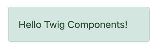 Alert 组件的示例
这会将客户端框架中熟悉的“组件”系统引入 Symfony。将其与 Live Components 结合使用,以创建具有自动、Ajax 驱动渲染的交互式前端。
想要演示吗?查看 https://ux.symfony.ac.cn/twig-component#demo
安装
让我们安装它!运行
1
$ composer require symfony/ux-twig-component就是这样!我们准备好了!如果您没有使用 Symfony Flex,请添加一个配置文件来控制组件的模板目录
1
2
3
4
5
6
# config/packages/twig_component.yaml
twig_component:
    anonymous_template_directory: 'components/'
    defaults:
        # Namespace & directory for components
        App\Twig\Components\: 'components/'
组件基础
让我们创建一个可重用的“警报”元素,我们可以用它来在我们的站点上显示成功或错误消息。第一步是创建一个组件类并为其添加 AsTwigComponent 属性 (attribute)
1
2
3
4
5
6
7
8
9
// src/Twig/Components/Alert.php
namespace App\Twig\Components;

use Symfony\UX\TwigComponent\Attribute\AsTwigComponent;

#[AsTwigComponent]
class Alert
{
}
这个类在技术上可以放在任何地方,但实际上,您会将其放在 config/packages/twig_component.yaml 中配置的命名空间下的某个位置。这有助于 TwigComponent name 您的组件并知道其模板的位置。
第二步是创建模板。默认情况下,模板位于 templates/components/{component_name}.html.twig 中,其中 {component_name} 与组件的类名匹配
1
2
3
4
{# templates/components/Alert.html.twig #}
<div class="alert alert-success">
    Success! You've created a Twig component!
</div>
这还不是很令人兴奋……因为消息是硬编码在模板中的。但这已经足够了!通过从任何其他 Twig 模板渲染您的组件来庆祝一下
1
{{ component('Alert') }}完成!您刚刚渲染了您的第一个 Twig 组件!您可以通过运行以下命令来查看它和任何其他组件
1
$ php bin/console debug:twig-component花点时间握拳庆祝一下 - 然后回来!
提示
如果您使用 Symfony MakerBundle,您可以使用 make:twig-component 命令轻松创建一个新组件
1
$ php bin/console make:twig-component Alert命名你的组件
要为您的组件命名,TwigComponent 会查看在 twig_component.yaml 中配置的命名空间并找到第一个匹配项。如果您有推荐的 App\Twig\Components\,那么
| 组件类 | 组件名称 |
|---|---|
App\Twig\Components\Alert |
Alert |
App |
Button:Primary |
: 字符在名称中代替 \ 使用。有关更多信息,请参阅 配置。
除了让 TwigComponent 选择名称之外,您还可以自己设置一个
1
2
3
4
#[AsTwigComponent('alert')]
class Alert
{
}
传递数据 (Props) 到你的组件中
为了使我们的 Alert 组件可重用,我们需要消息和类型(例如 success、danger 等)是可配置的。为此,为每个创建一个公共属性
1
2
3
4
5
6
7
8
9
10
11
12
// src/Twig/Components/Alert.php
  // ...

  #[AsTwigComponent]
  class Alert
  {
+     public string $message;

+     public string $type = 'success';

      // ...
}在模板中,Alert 实例通过 this 变量可用,公共属性可直接访问。使用它们来渲染两个新属性
1
2
3
4
5
6
<div class="alert alert-{{ type }}">
    {{ message }}

    {# Same as above, but using "this", which is the component object #}
    {{ this.message }}
</div>
我们如何填充 message 和 type 属性?通过将它们作为 “props” 通过 component() 的第二个参数传递
1
2
3
4
5
6
{{ component('Alert', {message: 'Successfully created!'}) }}

{{ component('Alert', {
    type: 'danger',
    message: 'Danger Will Robinson!'
}) }}
在幕后,将实例化一个新的 Alert 对象,并将 message 键(以及传递的 type)设置到对象的 $message 属性上。然后,组件被渲染!如果属性具有 setter 方法(例如 setMessage()),则将调用该方法而不是直接设置属性。
注意
您可以禁用为组件公开公共属性。禁用后,必须使用 this.property
1
2
3
4
5
#[AsTwigComponent(exposePublicProps: false)]
class Alert
{
    // ...
}
传递和渲染属性 (Attributes)
如果您传递组件类上不可设置的额外 props,则可以将它们渲染为 attributes
1
2
3
4
{{ component('Alert', {
    id: 'custom-alert-id',
    message: 'Danger Will Robinson!'
}) }}
要渲染 attributes,请使用每个组件模板中可用的特殊 attributes 变量
1
2
3
<div {{ attributes.defaults({class: 'alert alert-' ~ type}) }}>
    {{ message }}
</div>请参阅组件属性 (Attributes) 以了解更多信息。
组件模板路径
如果您使用默认配置,则模板名称将为:templates/components/{component_name}.html.twig,其中 {component_name} 与组件名称匹配。
| 组件名称 | 模板路径 |
|---|---|
Alert |
templates/components/Alert.html.twig |
Button:Primary |
templates/components/Button/Primary.html.twig |
名称中的任何 : 都会更改为子目录。
您可以通过 AsTwigComponent 属性 (attribute) 控制使用的模板
1
2
3
4
5
6
// src/Twig/Components/Alert.php
  // ...

- #[AsTwigComponent]
+ #[AsTwigComponent(template: 'my/custom/template.html.twig')]
class Alert您还可以为整个命名空间配置默认模板目录。请参阅配置。
组件 HTML 语法
到目前为止一切顺利!为了使 Twig 组件的使用更加方便,它带有一个类似 HTML 的语法,其中 props 作为 attributes 传递
1
<twig:Alert message="This is really cool!" withCloseButton />这将把 message 和 withCloseButton (true) props 传递给 Alert 组件并渲染它!如果 attribute 是动态的,请在 attribute 前面加上 : 或使用普通的 {{ }} 语法
1
2
3
4
5
6
7
<twig:Alert message="hello!" :user="user.id" />

// equal to
<twig:Alert message="hello!" user="{{ user.id }}" />

// pass object, array, or anything you imagine
<twig:Alert :foo="{col: ['foo', 'oof']}" />
布尔值 props 使用 PHP 的类型转换规则进行转换。字符串 “false” 被转换为布尔值 true。
要传递布尔值 false,您可以传递 Twig 表达式 {{ false }} 或使用动态语法(带有 : 前缀)
1
2
3
4
5
6
7
8
{# ❌ the string 'false' is converted to the boolean 'true' #}
<twig:Alert message="..." withCloseButton="false" />

{# ✅ use the 'false' boolean value #}
<twig:Alert message="..." withCloseButton="{{ false }}" />

{# ✅ use the dynamic syntax #}
<twig:Alert message="..." :withCloseButton="false" />
不要忘记您可以将 props 与您想要在根元素上渲染的 attributes 混合和匹配
1
<twig:Alert message="hello!" id="custom-alert-id" />要传递 attributes 数组,请使用 {{...}} 展开运算符语法。这需要 Twig 3.7.0 或更高版本
1
<twig:Alert {{ ...myAttributes }} />在本指南的其余部分,我们将使用 HTML 语法。
传递 HTML 到组件
与其将 message prop 传递给 Alert 组件,不如我们这样做呢?
1
2
3
<twig:Alert>
    I'm writing <strong>HTML</strong> right here!
</twig:Alert>
我们可以!当您在 <twig:Alert> 开始和结束标记之间添加内容时,它会作为名为 content 的 block 传递到您的组件模板。您可以像渲染任何普通 block 一样渲染它
1
2
3
<div {{ attributes.defaults({class: 'alert alert-' ~ type}) }}>
    {% block content %}{% endblock %}
</div>
您甚至可以为 block 提供默认内容。请参阅通过 Block 传递 HTML 到组件以了解更多信息。
在组件中使用宏
在组件内部定义内容效果很好,但是如果您想在组件内部使用宏怎么办?好消息:您可以!但是有一个问题:您不能使用 _self 关键字导入宏。相反,您需要使用定义宏的模板的完整路径
1
2
3
4
5
6
7
8
9
10
11
12
13
{% macro message_formatter(message) %}
    <strong>{{ message }}</strong>
{% endmacro %}

<twig:Alert>
    {# ❌ this won't work #}
    {% from _self import message_formatter %}

    {# ✅ this works as expected #}
    {% from 'path/of/this/template.html.twig' import message_formatter %}

    {{ message_formatter('...') }}
</twig:Alert>
获取服务
让我们创建一个更复杂的示例:“特色产品”组件。您可以选择将 Product 对象数组传递给组件,并将这些对象设置在 $products 属性上。但相反,让我们让组件完成执行查询的工作。
如何做到?组件是 services,这意味着自动装配像往常一样工作。此示例假设您有一个 Product Doctrine 实体和 ProductRepository
1
2
3
4
5
6
7
8
9
10
11
12
13
14
15
16
17
18
19
// src/Twig/Components/FeaturedProducts.php
namespace App\Twig\Components;

use App\Repository\ProductRepository;
use Symfony\UX\TwigComponent\Attribute\AsTwigComponent;

#[AsTwigComponent]
class FeaturedProducts
{
    public function __construct(private ProductRepository $productRepository)
    {
    }

    public function getProducts(): array
    {
        // an example method that returns an array of Products
        return $this->productRepository->findFeatured();
    }
}在模板中,getProducts() 方法可以通过 this.products 访问
1
2
3
4
5
6
7
8
{# templates/components/FeaturedProducts.html.twig #}
<div>
    <h3>Featured Products</h3>

    {% for product in this.products %}
        ...
    {% endfor %}
</div>
并且由于此组件没有任何我们需要填充的公共属性,因此您可以使用以下命令渲染它
1
<twig:FeaturedProducts />注意
因为组件是 services,所以可以使用正常的依赖注入。但是,每个组件 service 都注册为 shared: false。这意味着您可以安全地使用不同的数据多次渲染同一组件,因为每个组件都将是一个独立的实例。
挂载数据
大多数情况下,您将创建公共属性,然后在渲染时将值作为 “props” 传递给这些属性。但是,如果您需要执行更复杂的操作,则有几个 hooks。
mount() 方法
为了更好地控制 “props” 的处理方式,您可以创建一个名为 mount() 的方法
1
2
3
4
5
6
7
8
9
10
11
12
13
14
15
16
// src/Twig/Components/Alert.php
// ...

#[AsTwigComponent]
class Alert
{
    public string $message;
    public string $type = 'success';

    public function mount(bool $isSuccess = true): void
    {
        $this->type = $isSuccess ? 'success' : 'danger';
    }

    // ...
}
mount() 方法只调用一次:在您的组件实例化后立即调用。由于该方法具有 $isSuccess 参数,如果我们在渲染时传递 isSuccess prop,它将传递给 mount()。
1
2
3
4
<twig:Alert
    isSuccess="{{ false }}"
    message="Danger Will Robinson!"
/>
如果 prop 名称(例如 isSuccess)与 mount() 中的参数名称匹配,则 prop 将作为该参数传递,并且组件系统将不会尝试直接在属性上设置它或将其用于组件 attributes。
PreMount 钩子
如果您需要在数据挂载到组件之前修改/验证数据,请使用 PreMount 钩子
1
2
3
4
5
6
7
8
9
10
11
12
13
14
15
16
17
18
19
20
21
22
23
24
25
26
27
// src/Twig/Components/Alert.php
use Symfony\UX\TwigComponent\Attribute\PreMount;
// ...

#[AsTwigComponent]
class Alert
{
    public string $message;
    public string $type = 'success';

    #[PreMount]
    public function preMount(array $data): array
    {
        // validate data
        $resolver = new OptionsResolver();
        $resolver->setIgnoreUndefined(true);

        $resolver->setDefaults(['type' => 'success']);
        $resolver->setAllowedValues('type', ['success', 'danger']);
        $resolver->setRequired('message');
        $resolver->setAllowedTypes('message', 'string');

        return $resolver->resolve($data) + $data;
    }

    // ...
}
注意
在其默认配置中,OptionsResolver 处理所有 props。但是,如果传递的 props 多于 OptionsResolver 中定义的选项,则会提示错误,指示一个或多个选项不存在。为了避免这种情况,请将 ignoreUndefined() 方法与 true 一起使用。有关更多信息,请参阅忽略未定义的选项
1
$resolver->setIgnoreUndefined(true);此配置的主要缺点是 OptionsResolver 在解析数据时会删除每个未定义的选项。为了维护 OptionsResolver 中未定义的 props,请将来自钩子的数据与已解析的数据结合起来
1
return $resolver->resolve($data) + $data;从 preMount() 返回的数据将用作挂载的 props。
注意
如果您的组件有多个 PreMount 钩子,并且您想控制它们的调用顺序,请使用 priority attribute 参数:PreMount(priority: 10)(数字越大,调用越早)。
PostMount 钩子
在组件实例化并挂载其数据后,您可以通过 PostMount 钩子运行额外的代码
1
2
3
4
5
6
7
8
9
10
11
12
13
14
15
16
// src/Twig/Components/Alert.php
use Symfony\UX\TwigComponent\Attribute\PostMount;
// ...

#[AsTwigComponent]
class Alert
{
    #[PostMount]
    public function postMount(): void
    {
        if (str_contains($this->message, 'danger')) {
            $this->type = 'danger';
        }
    }
    // ...
}
PostMount 方法还可以接收一个数组 $data 参数,其中将包含传递给组件的任何尚未处理的 props(即,它们不对应于任何属性,也不是 mount() 方法的参数)。您可以处理这些 props,从 $data 中删除它们并返回数组
1
2
3
4
5
6
7
8
9
10
11
12
13
14
15
16
17
18
19
20
21
22
23
24
// src/Twig/Components/Alert.php
#[AsTwigComponent]
class Alert
{
    public string $message;
    public string $type = 'success';

    #[PostMount]
    public function processAutoChooseType(array $data): array
    {
        if ($data['autoChooseType'] ?? false) {
            if (str_contains($this->message, 'danger')) {
                $this->type = 'danger';
            }

            // remove the autoChooseType prop from the data array
            unset($data['autoChooseType']);
        }

        // any remaining data will become attributes on the component
        return $data;
    }
    // ...
}
注意
如果您的组件有多个 PostMount 钩子,并且您想控制它们的调用顺序,请使用 priority attribute 参数:PostMount(priority: 10)(数字越大,调用越早)。
匿名组件
有时一个组件足够简单,不需要 PHP 类。在这种情况下,您可以跳过类,只创建模板。组件名称由模板的位置确定
1
2
3
4
{# templates/components/Button/Primary.html.twig #}
<button {{ attributes.defaults({class: 'primary'}) }}>
    {% block content %}{% endblock %}
</button>
此组件的名称将是 Button:Primary,因为子目录
1
2
3
4
5
6
7
8
{# index.html.twig #}
...
<div>
   <twig:Button:Primary>Click Me!</twig:Button:Primary>
</div>

{# renders as: #}
<button class="primary">Click Me!</button>
像往常一样,您可以传递将在元素上渲染的额外 attributes
1
2
3
4
5
6
7
8
{# index.html.twig #}
...
<div>
   <twig:Button:Primary type="button" name="foo">Click Me!</twig:Button:Primary>
</div>

{# renders as: #}
<button class="primary" type="button" name="foo">Click Me!</button>
您还可以将变量 (prop) 传递到您的模板中
1
2
3
4
5
{# index.html.twig #}
...
<div>
    <twig:Button icon="fa-plus" type="primary" role="button">Click Me!</twig:Button>
</div>
要告诉系统 icon 和 type 是 props 而不是 attributes,请在模板顶部使用 {% props %} 标签。
1
2
3
4
5
6
7
8
9
{# templates/components/Button.html.twig #}
{% props icon = null, type = 'primary' %}

<button {{ attributes.defaults({class: 'btn btn-'~type}) }}>
    {% block content %}{% endblock %}
    {% if icon %}
        <span class="fa-solid fa-{{ icon }}"></span>
    {% endif %}
</button>
通过 Blocks 传递 HTML 到组件
Props 不是您可以传递给组件的唯一方式。您还可以传递内容
1
2
3
<twig:Alert type="success">
    <div>Congratulations! You've won a free puppy!</div>
</twig:Alert>
在您的组件模板中,这会变成一个名为 content 的 block
1
2
3
4
5
<div class="alert alert-{{ type }}">
    {% block content %}
        // the content will appear in here
    {% endblock %}
 </div>
您还可以添加更多命名的 blocks
1
2
3
4
5
6
<div class="alert alert-{{ type }}">
    {% block content %}{% endblock %}
    {% block footer %}
        <div>Default Footer content</div>
    {% endblock %}
 </div>
以正常方式渲染这些。
1
2
3
4
5
6
7
8
<twig:Alert type="success">
    <div>Congrats on winning a free puppy!</div>

    <twig:block name="footer">
        {{ parent() }} {# render the default content if needed #}
        <button class="btn btn-primary">Claim your prize</button>
    </twig:block>
</twig:Alert>
将内容传递到您的模板也可以通过 LiveComponents 完成,尽管有一些与变量作用域相关的注意事项。请参阅将 Blocks 传递给 Live Components。
还有一种非 HTML 语法可以使用
1
2
3
4
{% component Alert with {type: 'success'} %}
    {% block content %}<div>Congrats!</div>{% endblock %}
    {% block footer %}... footer content{% endblock %}
{% endcomponent %}
Blocks 内的上下文 / 变量
<twig:Component> 内部的内容应被视为存在于其自身独立的模板中,该模板扩展了组件的模板。这有一些有趣的后果。
首先,在 <twig:Component> 内部,this 变量表示您现在正在渲染的组件,并且您可以访问该组件的所有变量
1
2
3
4
5
6
7
8
{# templates/components/SuccessAlert.html.twig #}
{{ this.someFunction }} {# this === SuccessAlert #}

<twig:Alert type="success">
    {{ this.someFunction }} {# this === Alert #}

    {{ type }} {# references a "type" prop from Alert #}
</twig:Alert>
方便的是,除了来自 Alert 组件的变量之外,您还可以访问原始模板中可用的任何变量
1
2
3
4
5
{# templates/components/SuccessAlert.html.twig #}
{% set name = 'Fabien' %}
<twig:Alert type="success">
    Hello {{ name }}
</twig:Alert>
来自上层组件(例如 SuccessAlert)的所有变量都可以在下层组件(例如 Alert)的内容中访问。但是,由于变量是合并的,因此任何同名的变量都会被下层组件(例如 Alert)覆盖。这就是为什么 this 指的是嵌入式或“当前”组件 Alert。
在将内容传递给组件时,还有一种特殊的超能力:您的代码的执行方式就像它被“复制粘贴”到目标模板的 block 中一样。这意味着您可以从您正在覆盖的 block 中访问变量!例如
1
2
3
4
5
6
{# templates/component/SuccessAlert.html.twig #}
{% for message in messages %}
    {% block alert_message %}
        A default {{ message }}
    {% endblock %}
{% endfor %}
在覆盖 alert_message block 时,您可以访问 message 变量
1
2
3
4
5
6
{# templates/some_page.html.twig #}
<twig:SuccessAlert>
    <twig:block name="alert_message">
        I can override the alert_message block and access the {{ message }} too!
    </twig:block>
</twig:SuccessAlert>
2.13
通过 outerScope 变量引用上层组件作用域的功能在 2.13 中添加。
如前所述,来自下层组件的变量与来自上层组件的变量合并。当您需要访问来自上层组件的某些属性或函数时,可以通过 outerScope... 变量完成
1
2
3
4
5
6
7
8
9
10
11
12
{# templates/SuccessAlert.html.twig #}
{% set name = 'Fabien' %}
{% set message = 'Hello' %}
{% component Alert with {type: 'success', name: 'Bart'} %}
    Hello {{ name }} {# Hello Bart #}

    {{ message }} {{ outerScope.name }} {# Hello Fabien #}

    {{ outerScope.this.someFunction }} {# this refers to SuccessAlert #}

    {{ outerScope.this.someProp }} {# references a "someProp" prop from SuccessAlert #}
{% endcomponent %}
您可以继续引用更上层的组件。只需添加另一个 outerScope。但请记住,outerScope 引用仅在您进入(嵌入式)组件后才开始。
1
2
3
4
5
6
7
8
9
10
11
{# templates/FancyProfileCard.html.twig #}
{% component Card %}
    {% block header %}
        {% component Alert with {message: outerScope.this.someProp} %} {# not yet INSIDE the Alert template #}
            {% block content %}
                {{ message }} {# same value as below, indirectly refers to FancyProfileCard::someProp #}
                {{ outerScope.outerScope.this.someProp }} {# directly refers to FancyProfileCard::someProp #}
            {% endblock %}
        {% endcomponent %}
    {% endblock %}
{% endcomponent %}
继承和转发 “外部 Blocks”
<twig: 组件标记内的内容应被视为存在于其自身独立的模板中,该模板扩展了组件的模板。这意味着“外部”模板中的任何 blocks 都不可用。但是,您可以通过特殊的 outerBlocks 变量访问这些 blocks
1
2
3
4
5
6
7
8
9
10
11
12
13
{% extends 'base.html.twig' %}

{% block call_to_action %}<strong>Attention! Free Puppies!</strong>{% endblock %}

{% block body %}
  <twig:Alert>
      {# this would NOT work... #}
      {{ block('call_to_action') }}

      {# ...but this works! #}
      {{ block(outerBlocks.call_to_action) }}
  </twig:Alert>
{% endblock %}
outerBlocks 变量在嵌套组件中变得特别有用。例如,假设我们想要创建一个 SuccessAlert 组件
1
2
3
4
{# templates/some_page.html.twig #}
<twig:SuccessAlert>
    We will successfully <em>forward</em> this block content!
<twig:SuccessAlert>
我们已经有一个通用的 Alert 组件,让我们重用它
1
2
3
4
{# templates/components/Alert.html.twig #}
<div {{ attributes.defaults({class: 'alert alert-'~type}) }}">
    {% block content %}{% endblock %}
</div>为此,SuccessAlert 组件可以抓取通过 outerBlocks 变量传递给它的 content block,并将其转发到 Alert
1
2
3
4
{# templates/components/SuccessAlert.html.twig #}
<twig:Alert type="success">
    {{ block(outerBlocks.content) }}
</twig:Alert>
通过将原始 content block 传递到 Alert 的 content block 中,这将完美地工作。
组件属性 (Attributes)
组件的一个常见需求是为根节点配置/渲染 attributes。Attributes 是在渲染时传递的任何无法挂载到组件本身的 props。此额外数据被添加到 ComponentAttributes 对象中,该对象在组件的模板中作为 attributes 可用
1
2
3
4
{# templates/components/MyComponent.html.twig #}
<div {{ attributes }}>
  My Component!
</div>
在渲染组件时,您可以传递要添加的 html attributes 数组
1
2
3
4
5
6
<twig:MyComponent class="foo" style="color: red" />

{# renders as: #}
<div class="foo" style="color:red">
  My Component!
</div>
将 attribute 的值设置为 true 以仅渲染 attribute 名称
1
2
3
4
5
6
7
8
{# templates/components/Input.html.twig #}
<input {{ attributes }}/>

{# render component #}
<twig:Input type="text" value="" :autofocus="true" />

{# renders as: #}
<input type="text" value="" autofocus/>
将 attribute 的值设置为 false 以排除该 attribute
1
2
3
4
5
6
7
8
{# templates/components/Input.html.twig #}
<input {{ attributes }}/>

{# render component #}
<twig:Input type="text" value="" :autofocus="false" />

{# renders as: #}
<input type="text" value=""/>
要将自定义 Stimulus controller 添加到您的根组件元素
1
<div {{ attributes.defaults(stimulus_controller('my-controller', {someValue: 'foo'})) }}>注意
stimulus_controller() 函数需要 symfony/stimulus-bundle。
1
$ composer require symfony/stimulus-bundle注意
您可以调整在模板中公开的 attributes 变量
1
2
3
4
5
#[AsTwigComponent(attributesVar: '_attributes')]
class Alert
{
    // ...
}
默认值和合并
在组件模板中,您可以设置与传递的属性合并的默认值。传递的属性会覆盖默认值,但 class 除外。对于 class,默认值会被添加到前面
1
2
3
4
5
6
7
8
9
10
11
12
13
14
{# templates/components/MyComponent.html.twig #}
<button {{ attributes.defaults({class: 'bar', type: 'button'}) }}>Save</button>

{# render component #}
{{ component('MyComponent', {style: 'color:red'}) }}

{# renders as: #}
<button class="bar" type="button" style="color:red">Save</button>

{# render component #}
{{ component('MyComponent', {class: 'foo', type: 'submit'}) }}

{# renders as: #}
<button class="bar foo" type="submit">Save</button>
渲染
2.15
渲染 属性的功能已在 TwigComponents 2.15 中添加。
您可以使用 render() 方法完全控制要渲染的属性。
1
2
3
4
5
6
7
8
9
10
11
12
13
14
15
{# templates/components/MyComponent.html.twig #}
<div
  style="{{ attributes.render('style') }} display:block;"
  {{ attributes }} {# be sure to always render the remaining attributes! #}
>
  My Component!
</div>

{# render component #}
{{ component('MyComponent', {style: 'color:red;'}) }}

{# renders as: #}
<div style="color:red; display:block;">
  My Component!
</div>
注意
关于使用 render(),有几件重要的事情需要了解
您需要确保在调用
{{ attributes }}之前调用render()方法,否则某些属性可能会被渲染两次。例如1 2 3 4 5 6 7 8 9 10 11 12 13 14 15
{# templates/components/MyComponent.html.twig #} <div {{ attributes }} {# called before style is rendered #} style="{{ attributes.render('style') }} display:block;" > My Component! </div> {# render component #} {{ component('MyComponent', {style: 'color:red;'}) }} {# renders as: #} <div style="color:red;" style="color:red; display:block;"> {# style is rendered twice! #} My Component! </div>如果您在不调用
render()的情况下添加属性,它将被渲染两次。例如1 2 3 4 5 6 7 8 9 10 11 12 13 14 15
{# templates/components/MyComponent.html.twig #} <div style="display:block;" {# not calling attributes.render('style') #} {{ attributes }} > My Component! </div> {# render component #} {{ component('MyComponent', {style: 'color:red;'}) }} {# renders as: #} <div style="display:block;" style="color:red;"> {# style is rendered twice! #} My Component! </div>
仅
提取特定属性并丢弃其余属性
1 2 3 4 5 6 7 8 9 10 11 12
{# render component #}
{{ component('MyComponent', {class: 'foo', style: 'color:red'}) }}
{# templates/components/MyComponent.html.twig #}
<div {{ attributes.only('class') }}>
My Component!
</div>
{# renders as: #}
<div class="foo">
My Component!
</div>不包含
排除特定属性
1 2 3 4 5 6 7 8 9 10 11 12
{# render component #}
{{ component('MyComponent', {class: 'foo', style: 'color:red'}) }}
{# templates/components/MyComponent.html.twig #}
<div {{ attributes.without('class') }}>
My Component!
</div>
{# renders as: #}
<div style="color:red">
My Component!
</div>嵌套属性 (Attributes)
2.17
嵌套属性功能已在 TwigComponents 2.17 中添加。
您可以拥有不用于 root 元素而是用于其 descendants 元素之一的属性。这对于例如对话框组件很有用,您希望允许自定义对话框内容、标题和页脚的属性。这是一个例子
1 2 3 4 5 6 7 8 9 10 11 12 13 14 15 16 17 18 19 20 21 22 23 24 25 26 27 28 29 30
{# templates/components/Dialog.html.twig #}
<div {{ attributes }}>
<div {{ attributes.nested('title') }}>
{% block title %}Default Title{% endblock %}
</div>
<div {{ attributes.nested('body') }}>
{% block content %}{% endblock %}
</div>
<div {{ attributes.nested('footer') }}>
{% block footer %}Default Footer{% endblock %}
</div>
</div>
{# render #}
<twig:Dialog class="foo" title:class="bar" body:class="baz" footer:class="qux">
Some content
</twig:MyDialog>
{# output #}
<div class="foo">
<div class="bar">
Default Title
</div>
<div class="baz">
Some content
</div>
<div class="qux">
Default Footer
</div>
</div>嵌套是递归的,所以您可能会做类似这样的事情
1 2 3 4 5 6 7
<twig:Form
:form="form"
class="ui-form"
row:class="ui-form-row"
row:label:class="ui-form-label"
row:widget:class="ui-form-widget"
/>具有复杂变体 (CVA) 的组件
2.20
cva 函数已在 TwigComponents 2.20 中弃用,并将被
在 3.0 中移除。该函数现在由 twig/html-extra:^3.12 包提供,名称为 html_cva。
CVA (Class Variant Authority) 起源于 JavaScript 生态系统。它通过管理变体(例如,颜色、尺寸)来实现可重用、可自定义的组件。cva() Twig 函数定义了 base 类(始终应用)和特定于变体的类
1 2 3 4 5 6 7 8 9 10 11 12 13 14 15 16 17 18 19 20 21 22
{# templates/components/Alert.html.twig #}
{% props color = 'blue', size = 'md' %}
{% set alert = cva({
base: 'alert',
variants: {
color: {
blue: 'bg-blue',
red: 'bg-red',
green: 'bg-green',
},
size: {
sm: 'text-sm',
md: 'text-md',
lg: 'text-lg',
}
}
}) %}
<div class="{{ alert.apply({color, size}, attributes.render('class')) }}">
{% block content %}{% endblock %}
</div>然后使用 color 和 size 变体来选择所需的类
1 2 3 4 5 6 7 8 9
<twig:Alert color="green" size="sm">
...
</twig:Alert>
{# will render as: #}
<div class="alert bg-green text-sm">
...
</div>CVA 和 Tailwind CSS
CVA 与 Tailwind CSS 无缝集成,尽管可能会发生类冲突。使用来自 tales-from-a-dev/twig-tailwind-extra 的 tailwind_merge() 函数
来解决冲突
1 2 3
<div class="{{ alert.apply({color, size}, attributes.render('class'))|tailwind_merge }}">
{% block content %}{% endblock %}
</div>复合变体
为涉及多个变体的条件定义复合变体
1 2 3 4 5 6 7 8 9 10 11 12 13 14 15 16 17 18 19 20 21 22 23 24 25 26 27 28 29 30 31
{# templates/components/Alert.html.twig #}
{% props color = 'blue', size = 'md' %}
{% set alert = cva({
base: 'alert',
variants: {
color: { red: 'bg-red' },
size: { lg: 'text-lg' }
},
compoundVariants: [{
color: ['red'],
size: ['lg'],
class: 'font-bold'
}]
}) %}
<div class="{{ alert.apply({color, size}) }}">
{% block content %}{% endblock %}
</div>
{# index.html.twig #}
<twig:Alert color="red" size="lg">
...
</twig:Alert>
{# will render as: #}
<div class="alert bg-red text-lg font-bold">
...
</div>默认变体
如果没有变体匹配,您可以定义一组默认类来应用
1 2 3 4 5 6 7 8 9 10 11 12 13 14 15 16 17 18 19 20 21 22 23 24 25 26 27 28
{# templates/components/Alert.html.twig #}
{% set alert = cva({
base: 'alert',
variants: {
color: {
red: 'bg-red'
},
rounded: {
sm: 'rounded-sm',
md: 'rounded-md'
}
},
defaultVariants: {
rounded: 'md'
}
}) %}
{# index.html.twig #}
<twig:Alert color="red">
...
</twig:Alert>
{# will render as: #}
<div class="alert bg-red rounded-md">
...
</div>测试助手
您可以使用 InteractsWithTwigComponents trait 测试组件的挂载和渲染方式
1 2 3 4 5 6 7 8 9 10 11 12 13 14 15 16 17 18 19 20 21 22 23 24 25 26 27 28 29 30 31 32 33 34 35 36 37 38 39 40 41 42 43 44 45 46
use Symfony\Bundle\FrameworkBundle\Test\KernelTestCase;
use Symfony\UX\TwigComponent\Test\InteractsWithTwigComponents;
class MyComponentTest extends KernelTestCase
{
use InteractsWithTwigComponents;
public function testComponentMount(): void
{
$component = $this->mountTwigComponent(
name: 'MyComponent', // can also use FQCN (MyComponent::class)
data: ['foo' => 'bar'],
);
$this->assertInstanceOf(MyComponent::class, $component);
$this->assertSame('bar', $component->foo);
}
public function testComponentRenders(): void
{
$rendered = $this->renderTwigComponent(
name: 'MyComponent', // can also use FQCN (MyComponent::class)
data: ['foo' => 'bar'],
);
$this->assertStringContainsString('bar', (string) $rendered);
// use the crawler
$this->assertCount(5, $rendered->crawler()->filter('ul li'));
}
public function testEmbeddedComponentRenders(): void
{
$rendered = $this->renderTwigComponent(
name: 'MyComponent', // can also use FQCN (MyComponent::class)
data: ['foo' => 'bar'],
content: '<div>My content</div>', // "content" (default) block
blocks: [
'header' => '<div>My header</div>',
'menu' => $this->renderTwigComponent('Menu'), // can embed other components
],
);
$this->assertStringContainsString('bar', (string) $rendered);
}
}注意
InteractsWithTwigComponents trait 只能在扩展 Symfony 的测试中使用。
特殊的组件变量
默认情况下,您的模板将可以访问以下变量
thisattributes- ... 以及组件上的所有公共属性
还有一些其他特殊方法可以控制变量。
ExposeInTemplate 属性 (Attribute)
所有公共组件属性都可以在组件模板中直接使用。您可以使用 ExposeInTemplate 属性直接在组件模板中公开私有/受保护的属性和公共方法(someProp vs this.someProp, someMethod vs this.someMethod)。属性必须是可访问的(具有 getter)。方法不能有必需的参数
1 2 3 4 5 6 7 8 9 10 11 12 13 14 15 16 17 18 19 20 21 22 23 24 25 26 27 28 29 30 31 32 33 34 35 36 37 38 39 40 41 42 43 44 45 46 47 48 49 50 51 52 53
// ...
use Symfony\UX\TwigComponent\Attribute\ExposeInTemplate;
#[AsTwigComponent]
class Alert
{
#[ExposeInTemplate]
private string $message; // available as `{{ message }}` in the template
#[ExposeInTemplate('alert_type')]
private string $type = 'success'; // available as `{{ alert_type }}` in the template
#[ExposeInTemplate(name: 'ico', getter: 'fetchIcon')]
private string $icon = 'ico-warning'; // available as `{{ ico }}` in the template using `fetchIcon()` as the getter
/**
* Required to access $this->message
*/
public function getMessage(): string
{
return $this->message;
}
/**
* Required to access $this->type
*/
public function getType(): string
{
return $this->type;
}
/**
* Required to access $this->icon
*/
public function fetchIcon(): string
{
return $this->icon;
}
#[ExposeInTemplate]
public function getActions(): array // available as `{{ actions }}` in the template
{
// ...
}
#[ExposeInTemplate('dismissable')]
public function canBeDismissed(): bool // available as `{{ dismissable }}` in the template
{
// ...
}
// ...
}注意
在方法上使用 ExposeInTemplate 时,值会在渲染之前被急切地获取。
计算属性
在前面的示例中,我们没有立即查询特色产品(例如在 __construct() 中),而是创建了一个 getProducts() 方法,并通过 this.products 从模板中调用了该方法。
这样做是因为,作为一般规则,您应该使组件尽可能懒惰,并且仅在其属性上存储所需的信息(如果您稍后将组件转换为 live component,这也很有帮助)。通过这种设置,查询仅在实际调用 getProducts() 方法时才执行。这与 Vue 等框架中的“计算属性”概念非常相似。
但是 getProducts() 方法并没有什么神奇之处:如果您在模板中多次调用 this.products,则查询将被执行多次。
为了使您的 getProducts() 方法像真正的计算属性一样工作,请在模板中调用 computed.products。computed 是一个代理,它包装您的组件并缓存方法的返回值。如果再次调用它们,则使用缓存的值。
1 2 3 4 5 6 7 8 9 10 11 12 13
{# templates/components/FeaturedProducts.html.twig #}
<div>
<h3>Featured Products</h3>
{% for product in computed.products %}
...
{% endfor %}
...
{% for product in computed.products %} {# use cache, does not result in a second query #}
...
{% endfor %}
</div>注意
计算方法仅适用于没有必需参数的组件方法。
提示
确保不要在计算方法上使用 ExposeInTemplate 属性,否则该方法将被调用两次而不是一次,从而导致不必要的开销和潜在的性能问题。
事件
Twig Components 在实例化、挂载和渲染组件的整个生命周期中分派各种事件。
PreRenderEvent
订阅 PreRenderEvent 可以在组件渲染之前修改 twig 模板和 twig 变量
1 2 3 4 5 6 7 8 9 10 11 12 13 14 15 16 17 18 19 20 21 22 23 24 25
use Symfony\Component\EventDispatcher\EventSubscriberInterface;
use Symfony\UX\TwigComponent\Event\PreRenderEvent;
class HookIntoTwigPreRenderSubscriber implements EventSubscriberInterface
{
public function onPreRender(PreRenderEvent $event): void
{
$event->getComponent(); // the component object
$event->getTemplate(); // the twig template name that will be rendered
$event->getVariables(); // the variables that will be available in the template
$event->setTemplate('some_other_template.html.twig'); // change the template used
// manipulate the variables:
$variables = $event->getVariables();
$variables['custom'] = 'value';
$event->setVariables($variables); // {{ custom }} will be available in your template
}
public static function getSubscribedEvents(): array
{
return [PreRenderEvent::class => 'onPreRender'];
}
}PostRenderEvent
PostRenderEvent 在组件完成渲染后调用,并包含刚刚渲染的 MountedComponent。
PreCreateForRenderEvent
订阅 PreCreateForRenderEvent 可以在渲染过程开始时,在创建或水合组件对象之前收到通知。您可以访问组件名称、输入属性,并且可以通过设置 HTML 来中断该过程。此事件在重新渲染期间不会触发。
PreMountEvent 和 PostMountEvent
要在组件数据挂载之前或之后运行代码,您可以监听 PreMountEvent 或 PostMountEvent。
嵌套组件
完全可以将组件作为另一个组件内容的一部分包含进来。当您这样做时,所有组件都独立渲染。唯一的注意事项是,在使用嵌套组件时,您不能混合 Twig 语法和 HTML 语法
1 2 3 4 5 6 7 8 9 10 11 12 13 14 15 16 17 18 19 20 21 22 23 24 25 26 27 28
{# ❌ this won't work because it mixes different syntaxes #}
<twig:Card>
{# ... #}
{% block footer %}
<twig:Button:Primary :isBlock="true">Edit</twig:Button:Primary>
{% endblock %}
</twig:Card>
{# ✅ this works because it only uses the HTML syntax #}
<twig:Card>
{# ... #}
<twig:block name="footer">
<twig:Button:Primary :isBlock="true">Edit</twig:Button:Primary>
</twig:block>
</twig:Card>
{# ✅ this also works because it only uses the Twig syntax #}
{% component Card %}
{# ... #}
{% block footer %}
{% component 'Button:Primary' with {isBlock: true} %}
{% block content %}Edit{% endblock %}
{% endcomponent %}
{% endblock %}
{% endcomponent %}如果您正在使用 Live Components,那么关于父组件和子组件的重新渲染方式有一些指南。阅读 Live Nested Components。
配置
要查看配置选项的完整列表,请运行
1
$ php bin/console config:dump twig_component最重要的配置是 defaults 键,它允许您为组件的不同命名空间定义选项。这控制组件的命名方式以及模板的存放位置
1 2 3 4 5 6 7 8 9 10 11 12 13 14 15 16 17 18 19
# config/packages/twig_component.yaml
twig_component:
defaults:
# short form: components under this namespace:
# - name will be the class name that comes after the prefix
# App\Twig\Components\Alert => Alert
# App\Twig\Components\Button\Primary => Button:Primary
# - templates will live in "components/"
# Alert => templates/components/Alert.html.twig
# Button:Primary => templates/components/Button/Primary.html.twig
App\Twig\Components\: components/
# long form
App\Pizza\Components\:
template_directory: components/pizza
# component names will have an extra "Pizza:" prefix
# App\Pizza\Components\Alert => Pizza:Alert
# App\Pizza\Components\Button\Primary => Pizza:Button:Primary
name_prefix: Pizza如果组件类匹配多个命名空间,则将使用第一个匹配的命名空间。
第三方扩展包
当与第三方 bundle 集成时,Twig Components 的灵活性进一步扩展,允许开发人员将预构建的组件无缝地包含到他们的项目中。
匿名组件
2.20
匿名组件的 bundle 约定已在 TwigComponents 2.20 中添加。
使用来自第三方 bundle 的组件与使用来自您自己应用程序的组件一样简单。一旦 bundle 安装并配置完成,您就可以直接在 Twig 模板中引用其组件
1 2 3
<twig:Acme:Button type="primary">
Click me
</twig:Acme:Button>在这里,组件名称由 bundle 的 Twig 命名空间 Acme、后跟一个冒号以及组件路径 Button 组成。
注意
您可以通过检查 bin/console debug:twig 命令来发现每个注册 bundle 的 Twig 命名空间。
组件必须位于 bundle 的 templates/components/ 目录中。例如,引用为 <twig:Acme:Button> 的组件应该在 Acme bundle 中的 templates/components/Button.html.twig 处有其模板文件。
调试组件
随着应用程序的增长,您最终会拥有大量组件。此命令将帮助您调试一些组件问题。首先,debug:twig-component 命令列出所有位于 templates/components/ 中的应用程序组件
1 2 3 4 5 6 7 8 9 10 11 12
$ php bin/console debug:twig-component
+---------------+-----------------------------+------------------------------------+------+
| Component | Class | Template | Type |
+---------------+-----------------------------+------------------------------------+------+
| Coucou | App\Components\Alert | components/Coucou.html.twig | |
| RandomNumber | App\Components\RandomNumber | components/RandomNumber.html.twig | Live |
| Test | App\Components\foo\Test | components/foo/Test.html.twig | |
| Button | | components/Button.html.twig | Anon |
| foo:Anonymous | | components/foo/Anonymous.html.twig | Anon |
| Acme:Button | | @Acme/components/Button.html.twig | Anon |
+---------------+-----------------------------+------------------------------------+------+将一些组件的名称作为参数传递以打印其详细信息
1 2 3 4 5 6 7 8 9 10 11 12 13 14 15
$ php bin/console debug:twig-component RandomNumber

+---------------------------------------------------+-----------------------------------+
| Property                                          | Value                             |
+---------------------------------------------------+-----------------------------------+
| Component                                         | RandomNumber                      |
| Class                                             | App\Components\RandomNumber       |
| Template                                          | components/RandomNumber.html.twig |
| Type                                              | Live                              |
+---------------------------------------------------+-----------------------------------+
| Properties (type / name / default value if exist) | string $name = toto               |
|                                                   | string $type = test               |
| Live Properties                                   | int $max = 1000                   |
|                                                   | int $min = 10                     |
+---------------------------------------------------+-----------------------------------+
贡献
有兴趣贡献吗?访问此存储库的主要来源:https://github.com/symfony/ux/tree/main/src/TwigComponent。
向后兼容性承诺
此 bundle 旨在遵循与 Symfony 框架相同的向后兼容性承诺:https://symfony.ac.cn/doc/current/contributing/code/bc.html