Symfony UX TogglePassword
Symfony UX TogglePassword 是一个 Symfony 扩展包,为 Symfony 表单中的密码输入框提供可见性切换功能。它是 Symfony UX 倡议的一部分。
它允许访问者将密码字段的类型切换为文本,反之亦然。
安装
注意
在开始之前,请确保你的应用中配置了 StimulusBundle。
使用 Composer 和 Symfony Flex 安装扩展包
1
$ composer require symfony/ux-toggle-password如果你正在使用 WebpackEncore,请安装你的 assets 并重启 Encore (如果你正在使用 AssetMapper,则不需要)
1
2
$ npm install --force
$ npm run watch
在 Symfony 表单中使用
任何 PasswordType 都可以通过添加 toggle 选项转换为切换密码字段
1
2
3
4
5
6
7
8
9
10
11
12
13
14
15
16
// ...
use Symfony\Component\Form\Extension\Core\Type\PasswordType;

class CredentialFormType extends AbstractType
{
    public function buildForm(FormBuilderInterface $builder, array $options)
    {
        $builder
            // ...
            ->add('password', PasswordType::class, ['toggle' => true])
            // ...
        ;
    }

    // ...
}
默认情况下会激活自定义表单主题,将 widget 包装在 <div class="toggle-password-container"> 中。 你可以通过将 use_toggle_form_theme 选项设置为 false 来禁用它。
1
2
3
4
5
6
7
8
9
10
11
12
13
14
15
16
// ...
use Symfony\Component\Form\Extension\Core\Type\PasswordType;

class CredentialFormType extends AbstractType
{
    public function buildForm(FormBuilderInterface $builder, array $options)
    {
        $builder
            // ...
            ->add('password', PasswordType::class, ['toggle' => true, 'use_toggle_form_theme' => false])
            // ...
        ;
    }

    // ...
}
注意
注意: 如果你选择禁用提供的包表单主题,你将需要自行处理样式。
自定义标签和图标
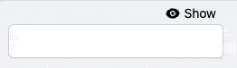
该字段默认使用 "Show" 和 "Hide" 文字以及来自 Heroicons 的 SVG 图标作为切换按钮。 你可以通过将 hidden_label, visible_label, hidden_icon 和 visible_icon 选项传递给字段来自定义它们 (使用 null 禁用标签或图标)
1
2
3
4
5
6
7
8
9
10
11
12
13
14
15
16
17
18
19
20
21
22
// ...
use Symfony\Component\Form\Extension\Core\Type\PasswordType;

class CredentialFormType extends AbstractType
{
    public function buildForm(FormBuilderInterface $builder, array $options)
    {
        $builder
            // ...
            ->add('password', PasswordType::class, [
                'toggle' => true,
                'hidden_label' => 'Masquer',
                'visible_label' => 'Afficher',
                'visible_icon' => null,
                'hidden_icon' => null,
            ])
            // ...
        ;
    }

    // ...
}
注意
注意: 标签选项均支持翻译。你可以使用翻译键字符串 (并通过 toggle_translation_domain 选项提供翻译域) 或 Symfony\Component\Translation\TranslatableMessage 对象。 将 false 传递给 toggle_translation_domain 选项将禁用标签的翻译。
自定义设计
该包提供了一个默认样式表以简化使用。 你可以禁用它以添加你自己的设计 (如果你希望的话)。
在 assets/controllers.json 中,通过将 @symfony/ux-toggle-password/dist/style.min.css 自动导入切换为 false 来禁用默认样式表
1
2
3
4
5
6
7
8
9
10
11
12
13
14
{
    "controllers": {
        "@symfony/ux-toggle-password": {
            "toggle-password": {
                "enabled": true,
                "fetch": "eager",
                "autoimport": {
                    "@symfony/ux-toggle-password/dist/style.min.css": false
                }
            }
        }
    },
    "entrypoints": []
}
注意
注意: 你应该将值设置为 false 而不是删除该行,这样 Symfony Flex 将来就不会尝试再次添加该行。
完成后,默认样式表将不再使用,你可以基于 TogglePassword 实现你自己的 CSS。
你还可以仅通过覆盖默认类来自定义特定的 TogglePassword 元素。 使用切换元素的 button_classes 选项添加你的自定义类名。 toggle_container_classes 选项也可用于自定义容器表单主题元素
1
2
3
4
5
6
7
8
9
10
11
12
13
14
15
16
17
18
19
20
// ...
use Symfony\Component\Form\Extension\Core\Type\PasswordType;

class CredentialFormType extends AbstractType
{
    public function buildForm(FormBuilderInterface $builder, array $options)
    {
        $builder
            // ...
            ->add('password', PasswordType::class, [
                'toggle' => true,
                'button_classes' => ['btn', 'primary', 'my-custom-class'],
                'toggle_container_classes' => ['input-group-text', 'my-custom-container'],
            ])
            // ...
        ;
    }

    // ...
}
扩展默认行为
如果你需要来自 JavaScript 的额外控制,你可以利用此包分发的一些事件
1
2
3
4
5
6
7
8
9
10
11
12
13
14
15
16
17
18
19
20
21
22
23
24
25
26
27
28
29
30
31
32
33
34
35
36
37
38
39
40
41
42
43
44
45
46
47
48
49
50
51
// assets/controllers/my-toggle-password_controller.js

import { Controller } from '@hotwired/stimulus';

export default class extends Controller {
    connect() {
        this.element.addEventListener('toggle-password:connect', this._onConnect);
        this.element.addEventListener('toggle-password:show', this._onShow);
        this.element.addEventListener('toggle-password:hide', this._onHide);
    }

    disconnect() {
        // You should always remove listeners when the controller is disconnected to avoid side-effects
        this.element.removeEventListener('toggle-password:connect', this._onConnect);
        this.element.removeEventListener('toggle-password:show', this._onShow);
        this.element.removeEventListener('toggle-password:hide', this._onHide);
    }

    _onConnect(event) {
        // The TogglePassword was just created.
        // You can for example add custom attributes to the toggle element
        const toggle = event.detail.button;
        toggle.dataset.customProperty = 'my-custom-value';

        // Or add a custom class to the input element
        const input = event.detail.element;
        input.classList.add('my-custom-class');
    }

    _onShow(event) {
        // The TogglePassword input has just been toggled for text type.
        // You can for example add custom attributes to the toggle element
        const toggle = event.detail.button;
        toggle.dataset.visible = true;

        // Or add a custom class to the input element
        const input = event.detail.element;
        input.classList.add('my-custom-class');
    }

    _onHide(event) {
        // The TogglePassword input has just been toggled for password type.
        // You can for example update custom attributes to the toggle element
        const toggle = event.detail.button;
        delete toggle.dataset.visible;

        // Or remove a custom class to the input element
        const input = event.detail.element;
        input.classList.remove('my-custom-class');
    }
}
然后在你的表单中,将你的控制器添加为 HTML 属性
1
2
3
4
5
6
7
8
9
10
11
12
13
14
15
16
17
18
19
// ...
use Symfony\Component\Form\Extension\Core\Type\PasswordType;

class CredentialFormType extends AbstractType
{
    public function buildForm(FormBuilderInterface $builder, array $options)
    {
        $builder
            // ...
            ->add('password', PasswordType::class, [
                'toggle' => true,
                'attr' => ['data-controller' => 'my-toggle-password'],
            ])
            // ...
        ;
    }

    // ...
}
不在 Symfony 表单中使用
你还可以将 TogglePassword 与原生 HTML 输入框一起使用。 在 stimulus_controller() 函数内部,你可以使用与前面章节中显示的选项相同的选项来自定义标签和图标
1
2
3
4
5
6
7
8
9
10
11
12
13
14
15
16
17
18
19
20
21
22
{# ... #}

{# add "toggle-password-container" or a class that applies "position: relative" to this container #}
<div class="toggle-password-container">
    <label for="password">Password</label>
    <input
        id="password"
        name="password"
        type="password"
        {{ stimulus_controller('symfony/ux-toggle-password/toggle-password', {
            visibleLabel: 'Show password',
            visibleIcon: 'Name of some SVG icon',
            hiddenLabel: 'Hide password',
            hiddenIcon: 'Name of some SVG icon',
            # you can add your own CSS classes if needed, but the following
            # CSS class is required to activate the default styles
            buttonClasses: ['toggle-password-button'],
        }) }}
    >
</div>

{# ... #}
向后兼容性承诺
此扩展包旨在遵循与 Symfony 框架相同的向后兼容性承诺: https://symfony.ac.cn/doc/current/contributing/code/bc.html